Responsive Web Design Course in Jalandhar | techcadd
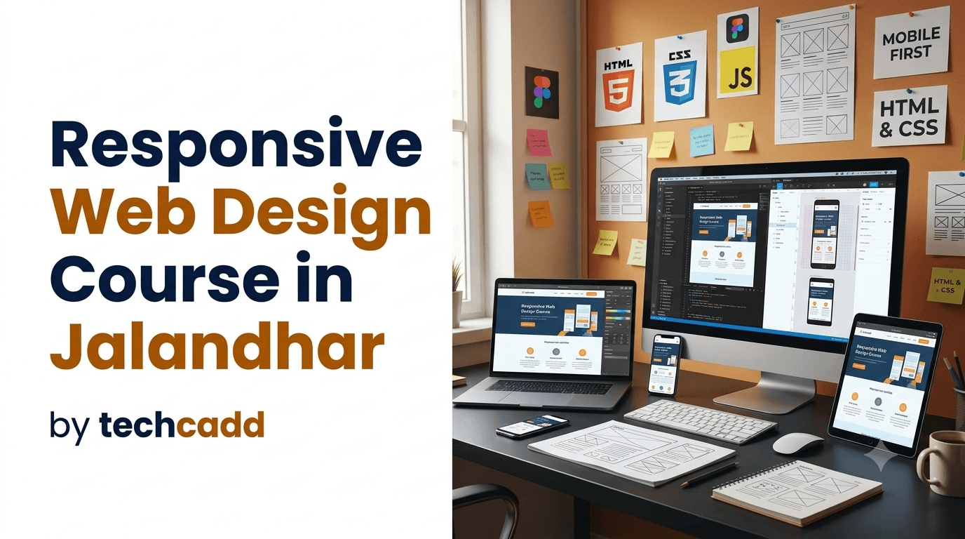
Learn responsive web design in Jalandhar at techcadd. Master HTML, CSS, Bootstrap, Flexbox, Grid, media queries, and mobile-friendly website projects.
On this page
- Responsive Web Design Course in Jalandhar
- Learn Responsive Web Design from the Basics
- Course Overview
- Understanding Responsive Web Design
- HTML Training for Website Structure
- CSS Styling and Layout Design
- Mobile-First Web Design
- CSS Media Queries and Breakpoints
- Responsive Images and Media
- Bootstrap Framework Training
- Practical Project-Based Learning
- Website Testing and Debugging
- Why Choose techcadd for Responsive Web Design Course?
- Who Can Join the Course?
- Career Opportunities After Responsive Web Design Training
- Build a Responsive Web Design Portfolio
- Future Scope of Responsive Web Design
- Enroll in Responsive Web Design Course in Jalandhar
Responsive Web Design Course in Jalandhar
A website is often the first point of contact between a business and its customers. With people browsing the internet on smartphones, tablets, laptops, and desktop computers, a website must provide a smooth experience on every screen. Responsive web design helps websites automatically adjust their layout, images, text, and navigation according to the device being used. techcadd offers a Responsive Web Design Course in Jalandhar for students, beginners, aspiring web designers, freelancers, and professionals who want to learn how to create modern, mobile-friendly, and user-friendly websites.
Responsive web design combines creative layout planning with front-end development techniques. It helps learners understand how to structure a web page, use flexible layouts, manage screen sizes, and create websites that are easy to navigate. Through practical training, students learn how to design websites that look professional and function properly across different devices.
Learn Responsive Web Design from the Basics
The Responsive Web Design Course in Jalandhar at techcadd is designed for learners who want to build a strong foundation in website design. The course starts with basic HTML and CSS concepts and gradually introduces advanced layout techniques, responsive components, and interactive website features.
Students learn how to create web pages from scratch, organize website content, style page elements, and adjust layouts for mobile, tablet, and desktop screens. The training includes demonstrations, coding exercises, design assignments, and practical projects so learners can apply each concept confidently.
Course Overview
The course covers the essential technologies and techniques used to create responsive websites. Students learn how HTML structures a web page, how CSS controls its appearance, and how responsive design techniques help websites adapt to different screen sizes.
Important topics covered during the course include:
Introduction to responsive web design
Understanding websites and web pages
HTML structure and semantic elements
HTML headings, paragraphs, links, and images
Lists, tables, and forms
CSS selectors and properties
Colors, backgrounds, fonts, and text styling
Margins, padding, borders, and spacing
CSS box model
Display and positioning properties
Flexbox layout
CSS Grid layout
Media queries
Mobile-first design
Responsive images and videos
Flexible units and measurements
Responsive navigation menus
Website accessibility basics
Browser developer tools
Website testing and debugging
Bootstrap framework
Practical responsive website projects
Understanding Responsive Web Design
Responsive web design is a method of creating websites that adjust automatically to different screen sizes. Instead of designing separate websites for every device, developers use flexible layouts, scalable images, and CSS media queries to create one website that works across multiple screens.
During the course, students learn how to identify common screen sizes and plan layouts accordingly. They practice designing web pages that remain readable and easy to use when viewed on mobile phones, tablets, laptops, and desktop computers.
Responsive design helps prevent problems such as horizontal scrolling, overlapping content, very small text, and buttons that are difficult to click. Learners understand how to create layouts that provide a consistent experience for all users.
HTML Training for Website Structure
HTML is the foundation of every website. It is used to organize content such as headings, paragraphs, images, links, forms, tables, and sections. Students learn how to create a clean and meaningful structure for web pages.
HTML topics include:
Basic HTML document structure
Headings and paragraphs
Links and navigation
Images and multimedia
Ordered and unordered lists
Tables
Forms and input fields
Semantic HTML5 elements
Page sections and containers
Metadata and basic SEO structure
Learners practice creating different web pages and linking them together to form a complete website. They also learn how to organize HTML code so that it remains readable and easy to maintain.
CSS Styling and Layout Design
CSS is used to control the visual appearance of a website. The course introduces students to the major CSS properties required for creating attractive and responsive layouts.
Students learn how to apply colors, fonts, backgrounds, borders, shadows, spacing, and alignment. They also practice arranging elements using Flexbox and CSS Grid.
CSS training includes:
Selectors and properties
Class and ID selectors
Text and font styling
Background images and colors
Borders and border radius
Margin and padding
Width and height
Box model
Display properties
Positioning
Flexbox
CSS Grid
Transitions and basic effects
Responsive units
These skills help learners create organized and visually appealing website layouts.
Mobile-First Web Design
Mobile-first design is an important approach in responsive development. It involves designing the website for smaller screens first and then improving the layout for larger devices.
Students learn how to create simple mobile layouts and gradually add columns, navigation features, images, and additional content for tablets and desktops. This approach helps ensure that the website remains usable on smaller screens.
Practical activities may include creating mobile-friendly menus, stacking content sections, resizing images, adjusting font sizes, and changing column layouts according to screen width.
CSS Media Queries and Breakpoints
Media queries allow developers to apply different CSS rules according to device characteristics such as screen width and orientation. The course explains how media queries work and how they can be used to create responsive layouts.
Learners practice setting breakpoints for mobile, tablet, and desktop views. They learn how to change the number of columns, adjust spacing, resize headings, hide or display elements, and modify navigation menus according to screen size.
Students also learn how to test their websites using browser developer tools and device preview options.
Responsive Images and Media
Images and videos should adjust properly within a responsive layout. Large or fixed-size media can cause horizontal scrolling and affect the user experience. The course teaches students how to use flexible image sizes, suitable containers, and responsive media techniques.
Learners practice:
Creating flexible images
Using maximum width properties
Maintaining image proportions
Designing image galleries
Adding responsive background images
Adjusting video containers
Optimizing images for faster loading
Selecting suitable image formats
These techniques help students create websites that look attractive without affecting performance or usability.
Bootstrap Framework Training
Bootstrap is a popular front-end framework that provides responsive grids, navigation components, buttons, cards, forms, and other design elements. The Responsive Web Design Course introduces students to Bootstrap so they can create layouts more efficiently.
Students learn how to use containers, rows, columns, responsive breakpoints, navigation bars, cards, buttons, forms, and utility classes. They practice building responsive websites with ready-made components while also understanding the underlying layout structure.
Bootstrap projects may include:
Responsive landing page
Business website
Course website
Portfolio page
Product showcase
Restaurant website
Contact page
Service listing page
Practical Project-Based Learning
Practical projects help learners understand how responsive web design is used in real website development. At techcadd, students can work on different projects that require planning, coding, styling, testing, and improvement.
Possible projects include:
Personal portfolio website
Responsive business website
Educational institute website
Restaurant website
Product landing page
Travel website
Blog layout
Online course page
Responsive image gallery
Service company website
Basic e-commerce front-end
Personal resume website
While working on projects, students learn how to organize files, create navigation, develop page sections, use responsive layouts, and test websites on different devices.
Website Testing and Debugging
A responsive website should be tested on different screen sizes and browsers. The course introduces learners to basic testing and debugging methods so they can identify and correct design problems.
Students learn how to check:
Mobile and desktop layouts
Text readability
Image alignment
Navigation functionality
Button spacing
Form appearance
Page loading behavior
Horizontal scrolling
Browser compatibility
Responsive breakpoints
Browser developer tools are used to inspect HTML and CSS, identify errors, and preview websites on different device sizes. These skills help learners improve the quality and reliability of their websites.
Why Choose techcadd for Responsive Web Design Course?
techcadd provides practical and career-focused training for students who want to learn website design and front-end development. The course is structured to make responsive design concepts easy to understand through demonstrations, coding practice, assignments, and projects.
Benefits of joining techcadd include:
Beginner-friendly course structure
Practical computer lab training
Step-by-step HTML and CSS learning
Training in responsive layout techniques
Flexbox and CSS Grid practice
Bootstrap framework training
Mobile-first design guidance
Realistic website projects
Website testing and debugging practice
Trainer support and doubt clarification
Portfolio development guidance
Career guidance for web design roles
Students receive opportunities to practice different layouts and improve their coding skills through regular feedback.
Who Can Join the Course?
The Responsive Web Design Course in Jalandhar is suitable for:
Students after 10th or 12th
College students
BCA and computer science learners
Beginners interested in website design
Graphic designers
Digital marketing students
Freelancers
Business owners
Working professionals
Students preparing for internships
Individuals interested in front-end development
Basic computer knowledge is helpful, but no previous coding experience is required for beginners.
Career Opportunities After Responsive Web Design Training
Responsive web design skills are useful in software companies, digital agencies, advertising firms, e-commerce businesses, educational institutes, and freelance projects. Learners who develop a good portfolio can apply for entry-level opportunities in website design and front-end development.
Possible career profiles include:
Junior Web Designer
Responsive Web Designer
Front-End Developer
HTML and CSS Developer
UI Developer
Website Designer
Web Design Assistant
WordPress Designer
Landing Page Designer
Freelance Web Designer
Website Maintenance Executive
Students can improve their career opportunities by learning JavaScript, PHP, MySQL, WordPress, React, UI/UX design, SEO, and other web development technologies.
Build a Responsive Web Design Portfolio
A portfolio allows learners to demonstrate their website design and coding skills. During the course, students can create a collection of responsive projects that work across mobile, tablet, and desktop screens.
A beginner portfolio may include a personal website, business landing page, responsive gallery, course website, product page, and contact form. Each project can include screenshots, design features, technologies used, and a brief description of the development process.
A professional portfolio helps learners prepare for internships, interviews, freelance work, and further web development training.
Future Scope of Responsive Web Design
Responsive design is an important part of modern website development because users access websites from many different devices. Businesses require websites that are easy to use, visually attractive, mobile-friendly, and accessible.
After completing the course, learners can expand their knowledge through JavaScript, advanced CSS, UI/UX design, Bootstrap, React, WordPress, PHP, MySQL, APIs, and full-stack web development. Combining responsive design with digital marketing, SEO, or graphic design can also help learners work on a wider range of projects.
Enroll in Responsive Web Design Course in Jalandhar
If you want to learn how to create mobile-friendly and professional websites, techcadd offers a Responsive Web Design Course in Jalandhar with practical training, coding assignments, and project-based learning. The course helps beginners understand HTML, CSS, responsive layouts, Bootstrap, website testing, and modern front-end design techniques.
Join techcadd to build responsive websites, improve your coding skills, develop a professional portfolio, and prepare for opportunities in web designing, front-end development, freelancing, and the digital industry.
Responsive Web Design Course in Jalandhar
Learn to create modern, mobile-friendly websites at Techcadd. Master HTML, CSS, Flexbox, Grid, media queries, Bootstrap, responsive layouts, and practical website projects through hands-on training.
Have a questionabout this?
Leave your number and a counsellor will call you back — about batch timings, fees, EMI options, placement record, or which track fits your degree.
- Free career counselling, no registration fee
- Weekday, evening, weekend or 1-on-1 batches
- Internship letter and placement support
Ready to get started?
Start building yourcareer today.
Talk to a counsellor today. One call is usually enough to know which track fits your degree, your schedule and the job you want.
- Free career counselling
- No registration fee
- Placement support included